Friday, 6 December 2013

Final Magazine Advert

Final Magazine Advert


Here is my final magazine advert. I have made some changes that were suggested to improve from the previous draft. The first thing I have done is added two more reviews. This is to adhere to conventions, as most magazine adverts use multiple reviews and not just one. I have also made the bottom section tidier and moved the download adverts to the bottom, as well as adding websites and contact details there. I have moved "Florentine" to the top, as many magazine adverts do this. I also made the stars smaller and made sure that the pills in the background photo could be seen. Overall I am very happy with this magazine advert and think it reflects my band and themes well, as well as adhering to conventions.

Thursday, 5 December 2013

Feedback

Feedback on Digipak, Magazine and Music Video

Today we received written feedback from our classmates on our entire coursework project, and also verbal feedback from our teachers which I have written down to hopefully improve my grade. Here is the feedback:

Digipak

-Verbal
-"Sorry" in the top left photo needs to be clearer and framed better.

-Written
-Very indie and follows conventions well
-Possibly too dark, lighten two of the photos with exposure
-Genre appropriate
-Follows conventions
-Love the back panel
-Nice font
-Pills panels are stronger than ones of the person.


Through this feedback I can see that there are a few changes I should make to my digipak. I should definitely make "Sorry" clearer and will do so by retaking the photo.  I also could possibly lighten two of the photos, however I feel this may take away from the dark feel to my digipak, something I may have to consider.

Magazine

-Verbal
- Stars need to be smaller
- iTunes and other logos need to be smaller and at the bottom
- Remove "Buy on iTunes"
- Extra review needed

-Written
-Like the gold stars
-Advert relates well to digipak
-Yellow stars don't fit
-Clear theme
-Looks really good

Through the feedback on my magazine I can see there are lots of changes to make. I should definately add a few more reviews, and remove the "Buy on iTunes" part. I should also make the stars smaller and move the logos to the bottom. Hopefully these changes will make my magazine more effective.

Music Video

-Verbal
-None

-Written
-Understandable narrative
- Some lip syncing under annunciation
-Logo very good
-Takes 10 minutes to walk a very short distance
- Like how start and end are linked
-Good narrative

Through this feedback I feel that there is very little to change for my music video. I cannot do much about the lip syncing as it is extremely difficult to pull off and I have tried my best, and I feel that the video is still effective despite this.


Nearly Final Magazine Draft

Nearly Final Magazine Draft


Here is my almost finished magazine draft, which I have received feedback on. My magazine carries through my key theme of choice and uses imagery of hands and pills again, to reflect the characters choice. I have also followed conventions, using a big bold text for my band name and release date, having reviews and stating where you can buy the album from. Hopefully my changes will render this a more effective poster.

Nearly Final Digipak Draft

Digipak- Nearly Final Draft


This is my digipak, which is now nearly in its final stages. I have received verbal feedback from my teacher and am going to make changes for my final product. I have used a colour theme of black and white, and my digipak also contains the key theme running throughout my media coursework of choice. Clearly, in my digipak I am showing a wrong choice made, and that unlike my music video you can't simply rewind.
I have used numerous closeups of a hand, and shots of pills to reflect the bad choice the character has made.
Hopefully my changes will bring my mark up further and make this a more effective digipak.

Monday, 18 November 2013

Ideas

Ideas for my Digipack

I have decided to take some photos for my inside artwork. My concept is to have a boy, lying on the floor next to some pills, and 3 "ghosts" of him standing around him, in a kitchen. I began with these four photos


I then took each photo, put it into photoshop and layered each on top of each other. I then history brushed each seperate "clone" onto one picture, as shown below


From this point I now needed to make my three outside characters look ghost-like and spooky. I did this by sectioning each character off with the pen tool, then making them slightly opaque and adding a blur effect.
My now nearly finished inside photo looks like this:


I am going to ask for feedback on this and see what improvements I can make, as this image will be split into three and run along my entire inside panel.


Magazine Research

Magazine Research


These three indie artist tour posters/ magazine adverts that I have found illustrate some of the conventions of an indie bands advertisements. Two of the posters show the band standing out from the crowd- Dog is Dead are shown wearing typically "indie" clothing , as are Mystery Jets. However the final poster is a lot more abstract and creative, and doesn't give much about the band away- showing they care more about the music than the band image.

All of the posters use an extremely bold font on the name of the band- this is to catch the attention of the reader- a consistent band font can add to the band image, such as with Dog Is Dead, who use the same font for all their music digipaks, posters and marketing. This can be crucial for these bands as they cannot rely on being recognised or famous so have to come up with ways for their listeners to associate with them.


The posters also tell the reader where to buy their tickets from, and advertise show dates and times. This can attract a bigger crowd to their gigs and make them more popular, which makes it another convention of indie posters.

The Dog Is Dead poster also advertises their new single, another convention of indie posters. This helps to spread word about the band, and hopefully attract more listeners to their gigs.

Many posters use the album artwork from their digipak as their magazine advertisement, to further reinforce their band image and advertise their album along with the tour.

In conclusion, for my magazine I will look to utilise all these conventions for my final magazine advertisement as they are crucial for representing an indie artist


Digipak Research

Digipak Research

Mainstream Album Artwork

Before I begin to create my digipak, I have decided to look further into what both mainstream and indie artists use for their digipaks and album artwork. This allows me to make sure my digipak hits all the conventions of a digipak of my style of artist, so my digipak is as successful as possible.

Mainstream Female Artists


Judging from these three album artworks, we can see that the mainstream female artist's digipaks are often rather sexualised, as shown by Rihanna and Taylor Swift's album covers. They also have little artistic creativity, with all 3 simply being photos of the artist. This is used to make potential buyers recognise the mainstream and famous pop-star, and make them want to buy the album. This technique would not work with indie artists as often they simply are not famous enough to be recognisable. There is also either a lot of colour or black and white being used, as Rihanna uses a black and white effect and the other two artworks are extremely colourful. Obviously these artworks are not very useful for my indie artist, however there is some conventions that can be taken away from them.

Mainstream Male Artists


Mainstream male artists are much the same as the female artists. They also use little artistic creativity, and all three have a photo of the artist, which is again a marketing technique necessary in the mainstream market to get potential customers to recognise the brand of the artist. There is some slight creativity in Eminem's cover, which the album artwork reflects the name of the album, Curtain Call. There is also use of the black and white filter in Jason Derulo's album, something present in the female artists covers. The font choice is also interesting, as they are all stylised and add to the professional look of the album. Overall there is some useful conventions I can take to hopefully distinguish my indie artist from these mainstream artists.

Mainstream Bands


Mainstream bands, whilst having some of the same conventions as other mainstream artists, seem to have some differences and will help with my digipak. Still, as you can see by Maroon 5 and Take That's album covers, the focus is on the artist, a key theme throughout mainstream artwork, and that establishes the band identity. However, there is a bit more artistic freedom, as shown by One Republics album cover, which does not feature the band at all. The artwork is also reasonably colourful, to draw the eye when on the shelf and hopefully attract buyers in.


Overall, from the mainstream album artwork I have seen there is a number of things I should try to avoid when making my indie artist digipak. I should try to avoid directly showing the artist, as this is something that these mainstream artists do to try to attract customers, and this doesn't work with indie artists as they simply don't have the brand recognition necessary for this. Another thing I should avoid is making my digipak overly sexualised or marketed towards a certain age range, as again, this is a technique that mainstream artists use to draw in customers and it shows them as more about the money than the music, something an indie artist should not represent.


Indie Album Artwork

After researching mainstream album artwork and deciding on mainstream features I should not use for my album artwork, I have decided to research into the genre my artist resides ; indie music, These pieces of album artwork should be much more appropriate for my artist and should give me some conventions to take through to my digipak.


These first three indie band album covers are all using one key convention of indie artwork- showing the band in a distinctive way. As shown with Tribes' album cover, they are shown looking distinctive and away from the "norm" of society, something that is key with indie artists, as it shows they are in it for the music, not the money. Similarly with the other two covers they are shown in a different way to mainstream artists, with slightly out-of-date clothes, leather jackets and costumes, something that wouldn't be seen on a mainstream album artwork. On Swim Deep's album there is also the use of a symbol to represent the band, something that is a convention of indie music, as many bands struggle to distinguish themselves so use symbols as a way to improve their brand.


These next three indie band cover another aspect used a lot in indie artwork- a symbolic representation of their album name.  The first cover represents the name "Dark Eyes" with a smoldering fire  and a dark left hand side of the photo. The other two similarly represent their album name and this is something crucially different to mainstream artwork- the fact that the digipak means something, and has a deeper meaning than just the artist. Many indie artists will pick a theme and have this running throughout their digipak, and this helps to show that their music means something, and is written by them and not "produced" by an external company using them for profit. This album artwork is definitely something I want to do, as it allows me to have a running theme throughout my digipak and adhere to indie digipak conventions.
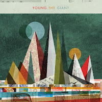


However, indie artworks can also be very abstract, like these three shown above. These types of album artwork give little information about the band. This is useful for an indie artist as it makes people simply listen to the music, and not worry about the bands image, which is crucial in mainstream artists artwork. It also allows for more artistic creativity, and the band can experiment with what they like best.


Overall, for my indie digipak I am looking at creating one with a running theme throughout, such as "Half Moon Run"'s album artwork, as I feel that it is creative and will allow me to hit lots of indie conventions and make my indie band stand out from the crowd.