Mainstream Album Artwork
Before I begin to create my digipak, I have decided to look further into what both
mainstream and indie artists use for their digipaks and album artwork. This allows me to make sure my digipak hits all the
conventions of a digipak of my style of artist, so my digipak is as successful as possible.
Mainstream Female Artists


Judging from these
three album artworks, we can see that th
e mainstream female artist's digipaks are often rather
sexualised, as shown by Rihanna and Taylor Swift's album covers. They also have little
artistic creativity, with all 3 simply being photos of the artist. This is used to make potential buyers recognise the
mainstream and famous pop-star, and make them want to buy the album. This technique would not work with
indie artists as often they simply are not famous enough to be recognisable. There is also either a lot of colour or
black and white being used, as Rihanna uses a black and white
effect and the other two artworks are extremely colourful. Obviously these artworks are not very useful for my
indie artist, however there is some
conventions that can be taken away from them.
Mainstream Male Artists


Mainstream male artists are much the same as the female artists. They also use little
artistic creativity, and all three have a photo of the artist, which is again a
marketing technique necessary in the
mainstream market to get potential customers to recognise the brand of the artist. There is some slight creativity in Eminem's cover, which the
album artwork reflects the name of the album, Curtain Call. There is also use of the
black and white filter in Jason Derulo's album, something present in the female artists covers. The font choice is also interesting, as they are all
stylised and add to the professional look of the album. Overall there is some useful
conventions I can take to hopefully distinguish my
indie artist from these mainstream artists.
Mainstream Bands


 Mainstream bands
, whilst having some of the
same conventions as other mainstream artists, seem to have some differences and will help with my digipak. Still, as you can see by Maroon 5 and Take That's album covers, the
focus is on the artist, a key theme throughout mainstream artwork, and that establishes the
band identity. However, there is a bit more artistic freedom, as shown by One Republics album cover, which does not feature the band at all. The artwork is also reasonably colourful, to draw the eye when on the shelf and hopefully
attract buyers in.
Overall, from the
mainstream album artwork I have seen there is a number of things I should try to avoid when making my
indie artist digipak. I should try to avoid directly showing the artist, as this is something that these mainstream artists do to try to attract customers, and this doesn't work with indie artists as they simply don't have the brand recognition necessary for this. Another thing I should avoid is making my digipak overly
sexualised or marketed towards a certain age range, as again, this is a technique that
mainstream artists use to draw in customers and it shows them as more about the money than the music, something an indie artist should not represent.
Indie Album Artwork
After researching
mainstream album artwork and deciding on mainstream features I should not use for my album artwork, I have decided to research into the genre my artist resides ;
indie music, These pieces of album artwork should be much more appropriate for my artist and should give me some
conventions to take through to my digipak.


These first three indie band album covers are all using one
key convention of indie artwork- showing the
band in a distinctive way. As shown with Tribes' album cover, they are shown looking distinctive and away from the
"norm" of society, something that is key with
indie artists, as it shows they are in it for the music, not the money. Similarly with the other two covers they are shown in a different way to mainstream artists, with slightly out-of-date clothes, leather jackets and costumes, something that wouldn't be seen on a mainstream album artwork. On Swim Deep's album there is also the
use of a symbol to represent the band, something that is a
convention of indie music, as many bands struggle to distinguish themselves so use symbols as a way to improve their brand.


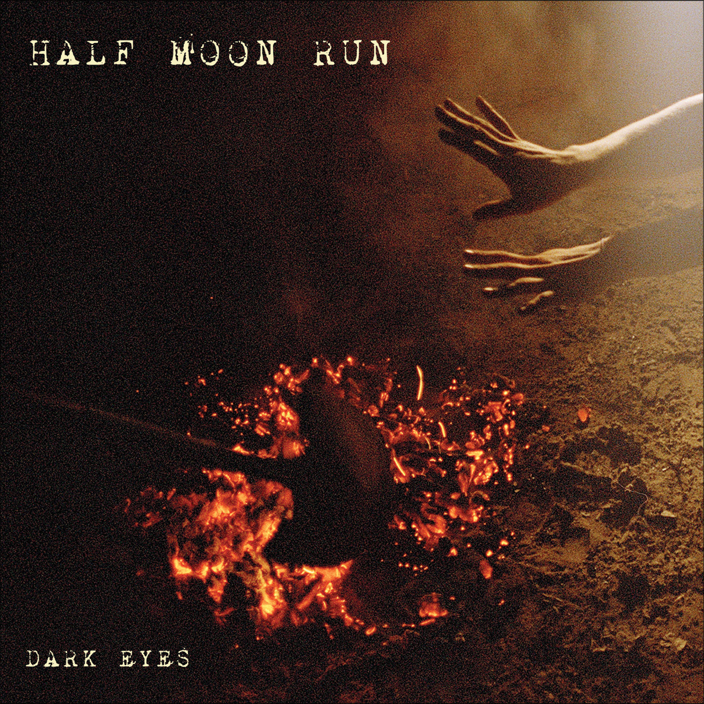
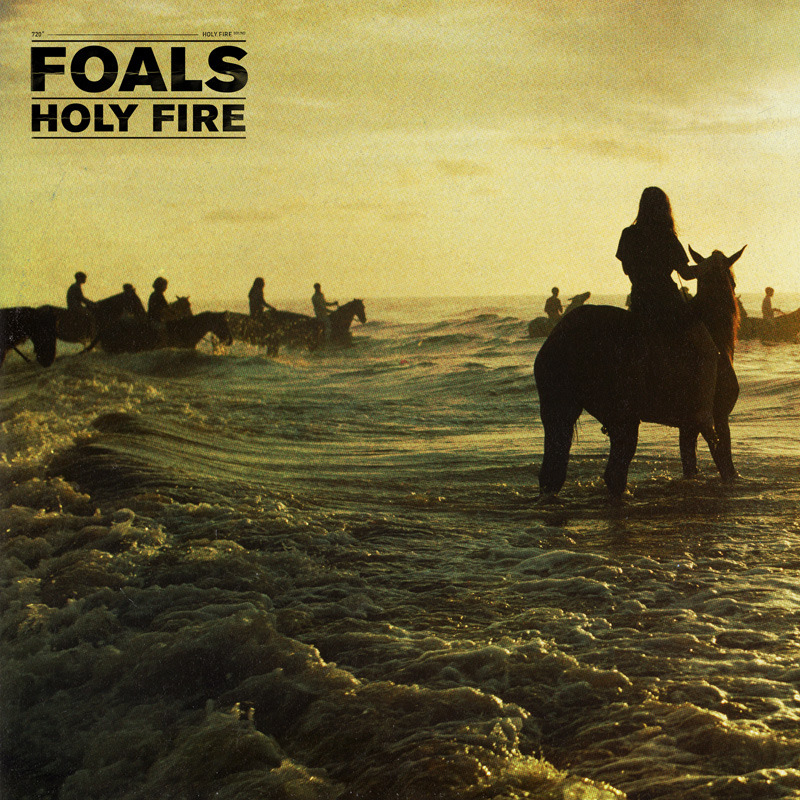
These next three indie band cover another aspect used a lot in indie artwork- a
symbolic representation of their album name. The first cover represents the name "Dark Eyes" with a smoldering fire and a dark left hand side of the photo. The other two similarly represent their album name and this is something
crucially different to mainstream artwork- the fact that the digipak means something, and
has a deeper meaning than just the artist. Many indie artists will
pick a theme and have this running throughout their digipak, and this helps to show that their music means something, and is written by them and not
"produced" by an external company using them for profit. This album artwork is definitely something I want to do, as it allows me to have a running theme throughout my digipak and adhere to indie digipak conventions.


However,
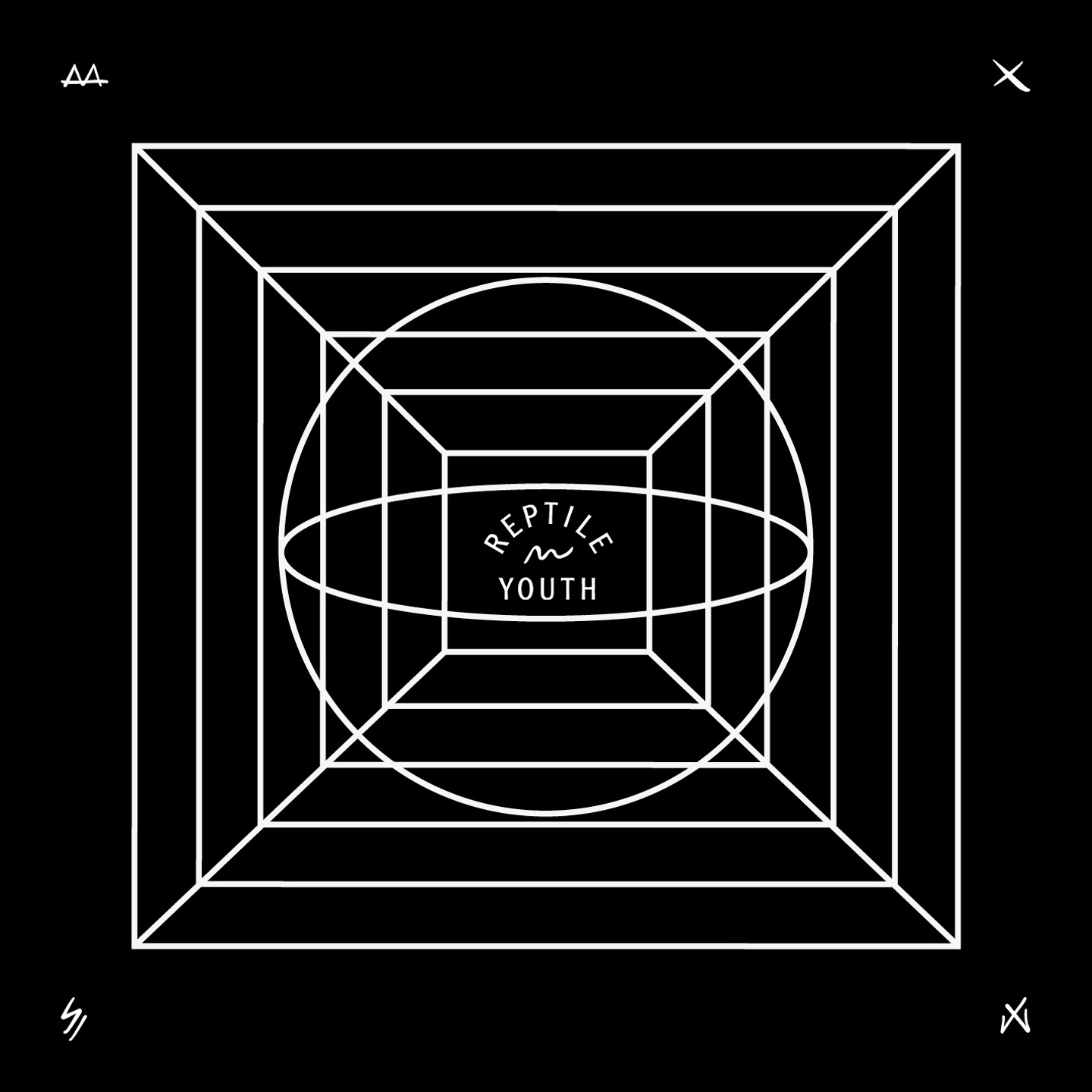
indie artworks can also be very abstract, like these three shown above. These types of album artwork give little information about the band. This is useful for an indie artist as it makes people
simply listen to the music, and not worry about the bands image, which is crucial in mainstream artists artwork. It also allows for more
artistic creativity, and the band can experiment with what they like best.
Overall, for my indie digipak I am looking at creating one with a running theme throughout, such as "Half Moon Run"'s album artwork, as I feel that it is creative and will allow me to hit lots of indie conventions and make my indie band stand out from the crowd.


